When you’re deciding on color-schemes for your home’s exterior, a number of factors bear consideration: the type of home you have, your surroundings, light conditions (lots of sun, little sun), etc.
Resale value also often comes into play — understandably so. Homes are most people’s most valuable asset, and fear of decreasing value often leads people to play it very safe with their home’s exterior color-schemes.
Unfortunately “safe” often ends up being vaguely unsatisfying. The house looks “fine” but seems to lack personality. Here’s where judicious use of accent colors can really make a difference.
The 70-20-10 Scheme
In interior decorating, the 70-20-10 scheme means using a main color (including tints) for 70% of the space (walls, floors, large furnishings); using a second color for 20% of the space’s elements and furnishings, and a third, bold color for 10% of the spaces elements and furnishings.
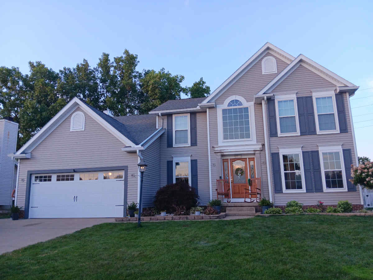
The same idea can be used for your exterior color-scheme. The dominant color would be used for all or most (depending on your home’s design) of your siding; a second, complementary color can be used on all or most of your trim features, with a third (complementary or opposite) color applied to a few key elements such as the front door, shutters, small trim features and porch furniture. Sometimes adding a feature to then paint in an accent color greatly increases the personality and curb appeal of your home. Consider shutters, window-boxes, trellises, awnings, porch features, additional trim elements and the like.
A simple classic combination is white or ivory for siding, navy or black for trim, and red for shutters and front door. An even more classic combo is two-color: white or ivory for siding and black or navy for trim, front door, shutters etc. but the addition of the third color (red) immediately energizes the scheme.
The colors themselves should harmonize. Warm colors with warm colors, cool colors with cool colors. The presence of bricks in foundations, porches and walkways should also be factored in; ideally your overall color-scheme enhances brick elements and doesn’t clash with them.
The addition of secondary and accent colors is a relatively inexpensive way to make your home’s exterior more interesting and pleasing.