When you’re considering paint colors for your home’s exterior, we advise focusing on the direction the front of your house faces and work with the qualities of light characteristic of that direction.
Northern Exposure
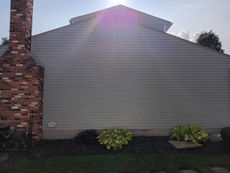
When you’re facing north in the northern hemisphere, natural light is cool (slightly gray) and consistent. Artists have traditionally favored studios with northern light because the light stays steady. Northern light is reflected and indirect, not subject to the extreme fluctuations of southern light. So, the way your paint looks on the north side of your house will stay, perceptively, pretty consistent throughout the day and year.
Northern light is cool. If you pick a cool version of your preferred color(s), including white, it will look even more cool, which can be dreary, especially in winter or on overcast days. It’s usually advisable to go with a slightly warm version of your color choice. If you specifically want to use warm colors, you may need to go a bit warmer than you’d think because northern light will act as a coolant.
If you want to use white, avoid whites with blue, green or violet undertones; look for whites with yellow, red or orange undertones. They can counteract the natural coolness of northern light and be seen as more pleasing and welcoming.
Southern Exposure
Southern light is direct and changeable. When the sun is shining it will hit your facade at full force. When there’s clouds, the colors will be comparatively softer. The intensity of the light itself will vary throughout the day and the year. Where northern light is consistent, southern light fluctuates, but at its height, it will always be much stronger than the light on your house’s north side. Your paint color will appear the most “true” at mid-morning and mid-afternoon. Very light colors may wash out in full sun; dark colors will appear a shade or two lighter in full sun. Colors with a mid-range of LRV (Light Reflectance Value: 50-55, give or take) will stay truer in strong sunlight than those with high LRV scores, which can wash out.
Southern light darkens shadows compared to northern light, potentially creating more areas of contrast on a facade. If you have a lot of greenery in front of your home, southern light will pick it up and add a greenish cast to your facade.
If you try out some paint colors on your exterior, make sure to look at them throughout the day. No single point in time will be fully representative of what you can expect.
Eastern Exposure
Eastern light is bright in the morning and cool and grayish in the afternoon. The morning light is neutral rather than cool or warm, and your facade can look considerably lighter than it will later in the day. If your house faces east your goal is to find a version of your preferred color(s) that won’t wash out in the morning and won’t become drab in the afternoon. Mid-range LRVs can help: 50-60, give or take.
Western Exposure
Western light is flat and grey in the morning, warm and rich in the afternoon. The warm quality of western light can greatly change your perception of a given color and the contrast between morning and afternoon is especially strong on west-facing facades because the morning light is so cool and afternoon light so warm. Grays can look like tans in the afternoon; tans can look like grays in the morning. Of course, cloud-cover will exaggerate the morning’s grayness and mute the afternoon’s orange-ness.
Western light casts the longest shadows, potentially creating large dark areas on your facade.
With a west-facing facade, your focus should be on finding colors that don’t become too dreary in the morning or too orange — unless you like that! — or heavy in the afternoons.
Managing Your Expectations
Northeast Ohio has a variable climate with lots of overcast days. Cloud cover mutes your paint colors no matter what your facade’s exposure. At the same time, with the exception of a northern exposure — which is the most stable and therefore predictable — you have a lot of variables to consider when trying to finalize color choices. But the key here is to recognize there is no color that will look the same under all conditions; be aware of and accept that truth. With that in mind, you can look for colors that you find pleasing under the range of lighting conditions that will affect perception of your front facade.